
Page's Sub-Page: Page Layout
This sub-page consists of a detailed look at one of the most complex pages in SDSU's "Unidos" Omeka S exhibit. When it comes to page layout, the back-end of a page might not be in the same order as what the front-end displays to the public. Many time, to get the right look, certain blocks will need to be above or below other blocks to produce the desired outcome.
Important to note: Omeka S pages cannot wrap text around an image. The text and the image will begin at the same horizontal point of the screen.
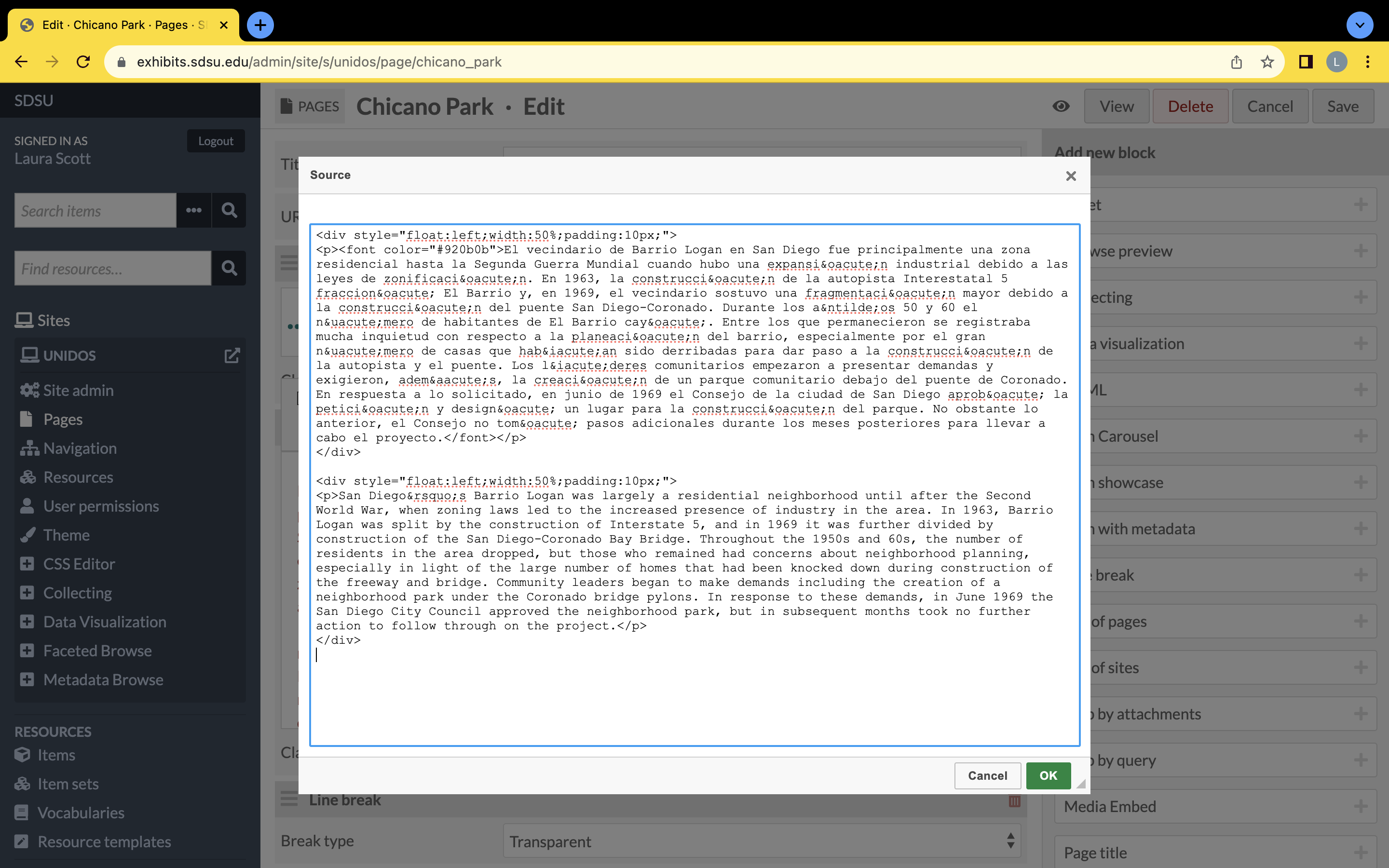
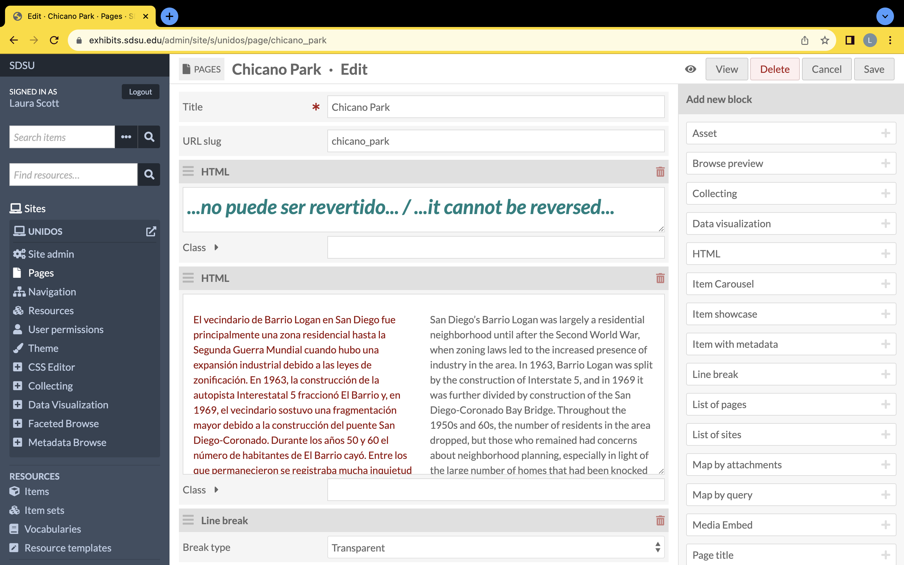
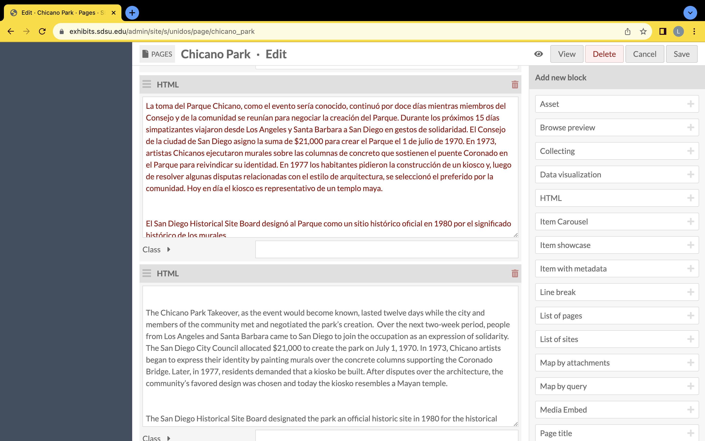
The leftmost, first row is what is displayed on the "Chicano Park" page of the "Unidos" exhibit for the public to see. The middle second and rightmost third rows show the back-end of the "Chicano Park" page. The images cannot be enlarged for viewing because they were uploaded as assets (in the main page's page it further describes how an asset is stagnant). If you wish to see clearly the details of this page layout you may zoom in your screen by clicking on the three vertical dots on the top right of your windowed tab and select the zoom function to zoom your screen to a desirable amount.
On the bottom of this page, I go into further detail about how each item, text, and line break created Unidos' "Chicano Park" page.
In this first column, there is only text. There are two styles and formats to the text because it lets the viewer separate the text into divergent agendas from the curator.
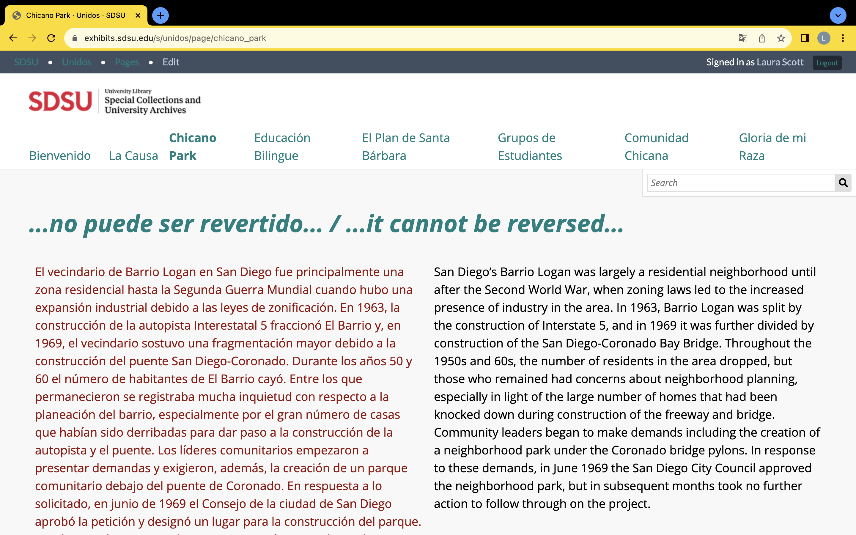
The first text shown is a large, teal bilingual statement. The statement is a quote that runs along the entire “Unidos” site by including a couple words of the quote on each main page of the site. To separate the quote from all other text, the curator decided to format each piece of the quote as “Heading 1” in the Omeka S pop up HTML tool bar and alter the text’s color with the hex #008080.
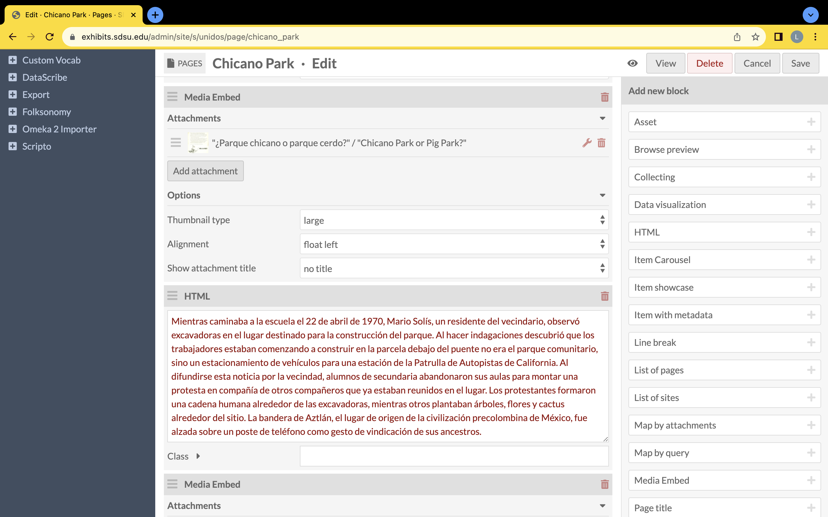
The second text block is like all other long texts in the “Unidos” site. On the rightmost third row is an image of the source code for how the second text block split the paragraph and altered the color of one side of text and not the other. If you wish to split your own Omeka S exhibit’s text into two rows, visit the coding subpage in this Omeka S tutorials site. The reason the curator chose to split the bilingual text, where the Spanish text was hex #920b0b located on the left and the English text was the default color on the right, was to showcase a vibrant Chicano/a culture in San Diego by making all of the text, even the metadata, bilingual without having to make the text seem so long. Placing the two languages side-by-side at the beginning of the page helps the reader know that there are two languages utilized within the “Unidos” exhibit. The color changes also stay consistent to help the viewer understand which block of text contains Spanish and which is English.
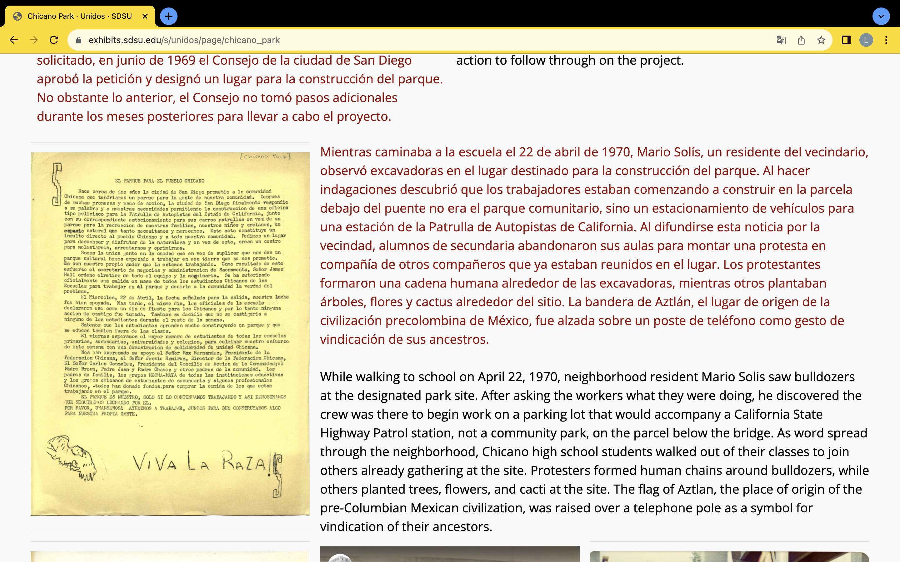
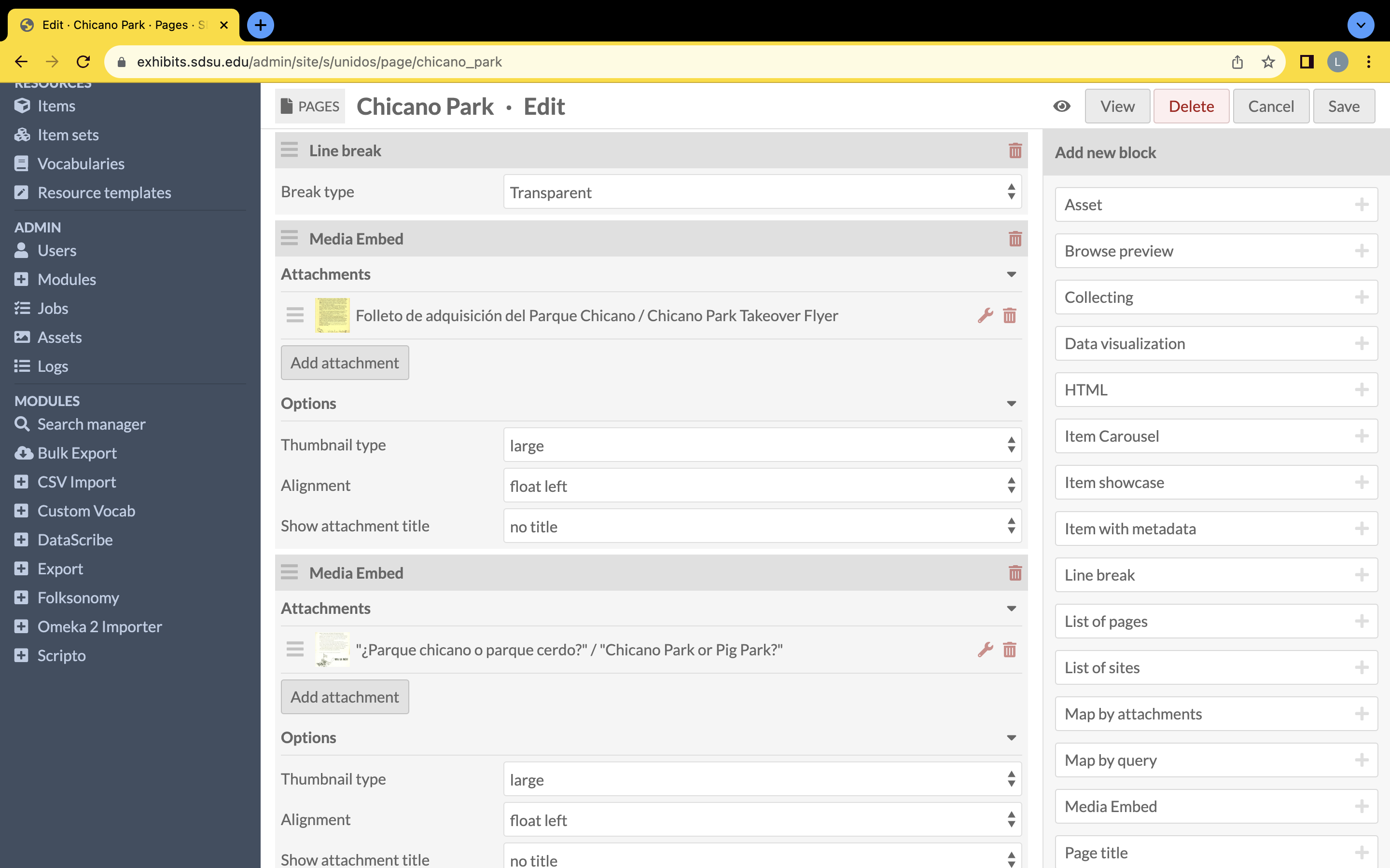
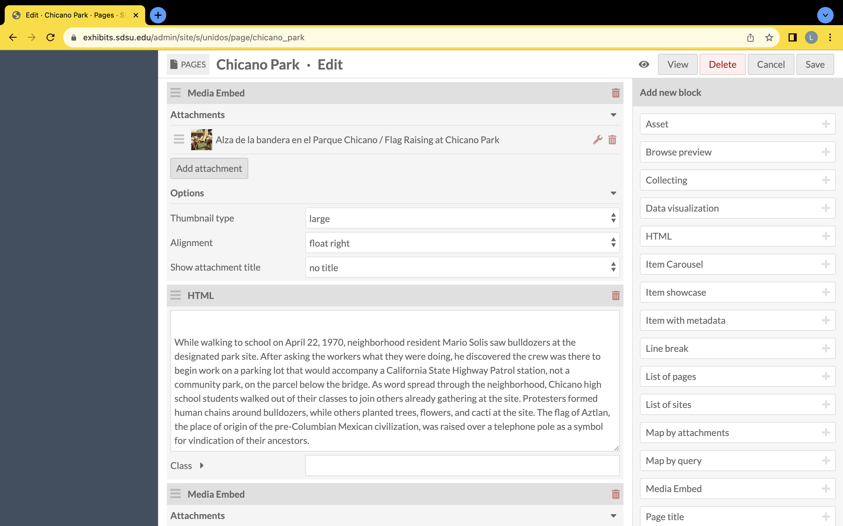
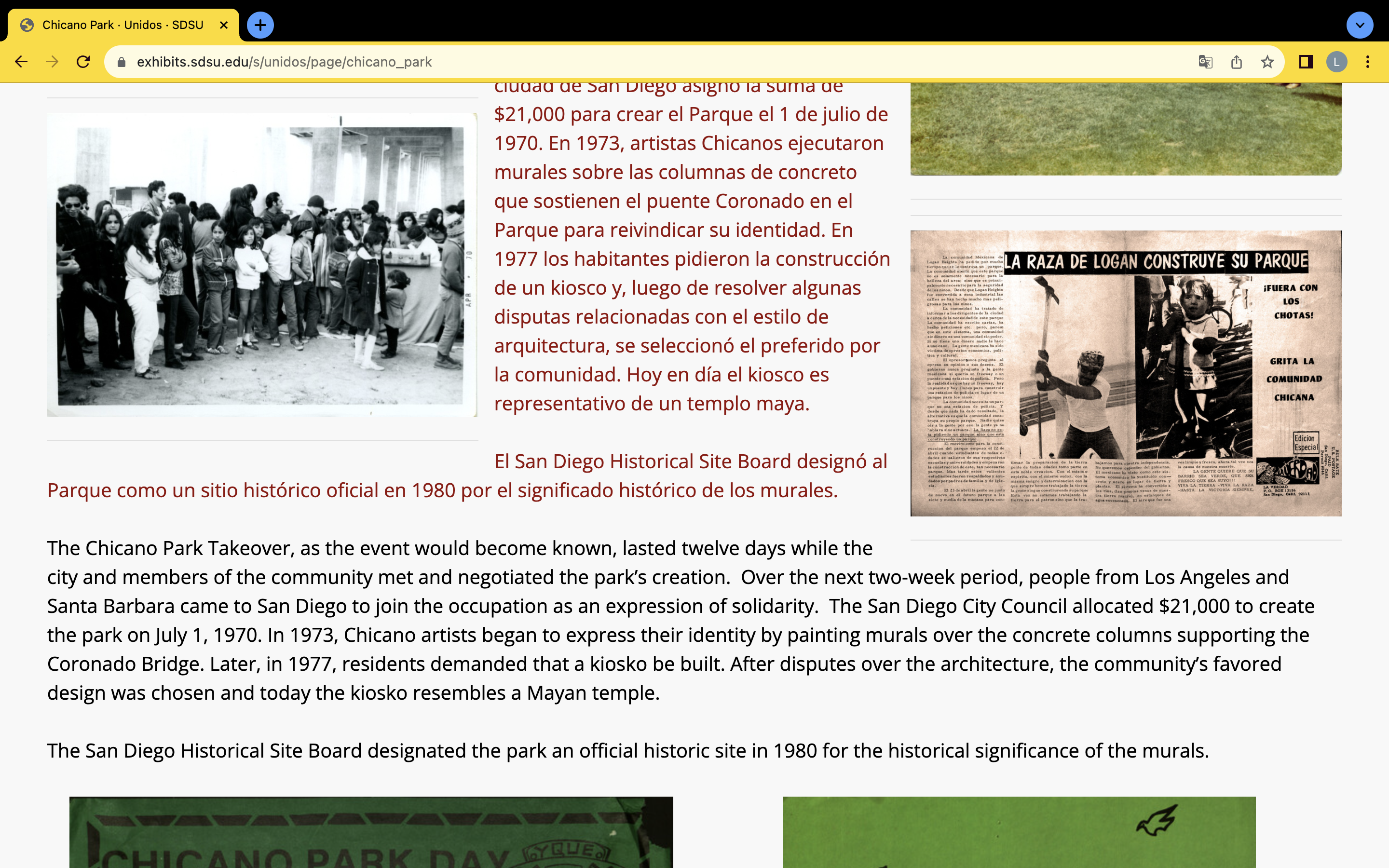
This second column includes an image and text. On the back-end of the page, seen in the middle second row, the image seen in the leftmost first row precedes the text. Also, there is a line break between the image and the text discussed in Column 1.
What is interesting about this second column is the middle second and rightmost third row, show that another media embedded block placed an image in between the image we see on the front facing part, in the leftmost first row of this column, and the bilingual text. This is what was meant when the main page’s page noted that the back-end of any page layout might not follow the order of content displayed on the page’s front-end.

The third column shows even further how the back-end of an Omeka S page could have images and text placed in a sequence different from how each block is displayed on the front-end. The text from column two is separated by the media embed located at the top right of the leftmost first row image in this third column.

The fourth column also includes a detailed look at how different the back-end of an Omeka S page looks from the front-end. This is also why it is important to play around in the pages tool at the beginning of curating your exhibit because the relationship between blocks can change depending on what you are trying to achieve.
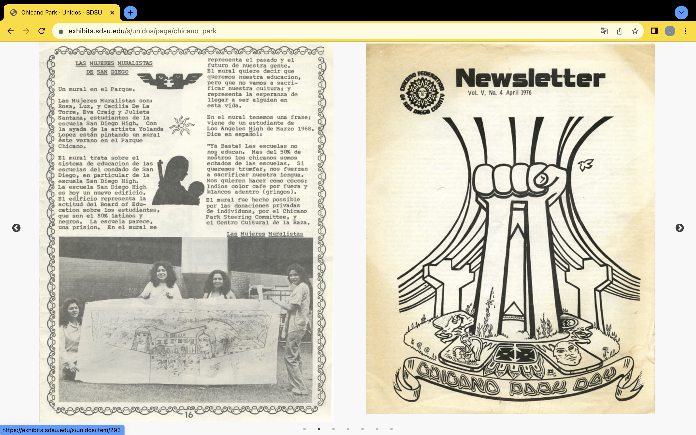

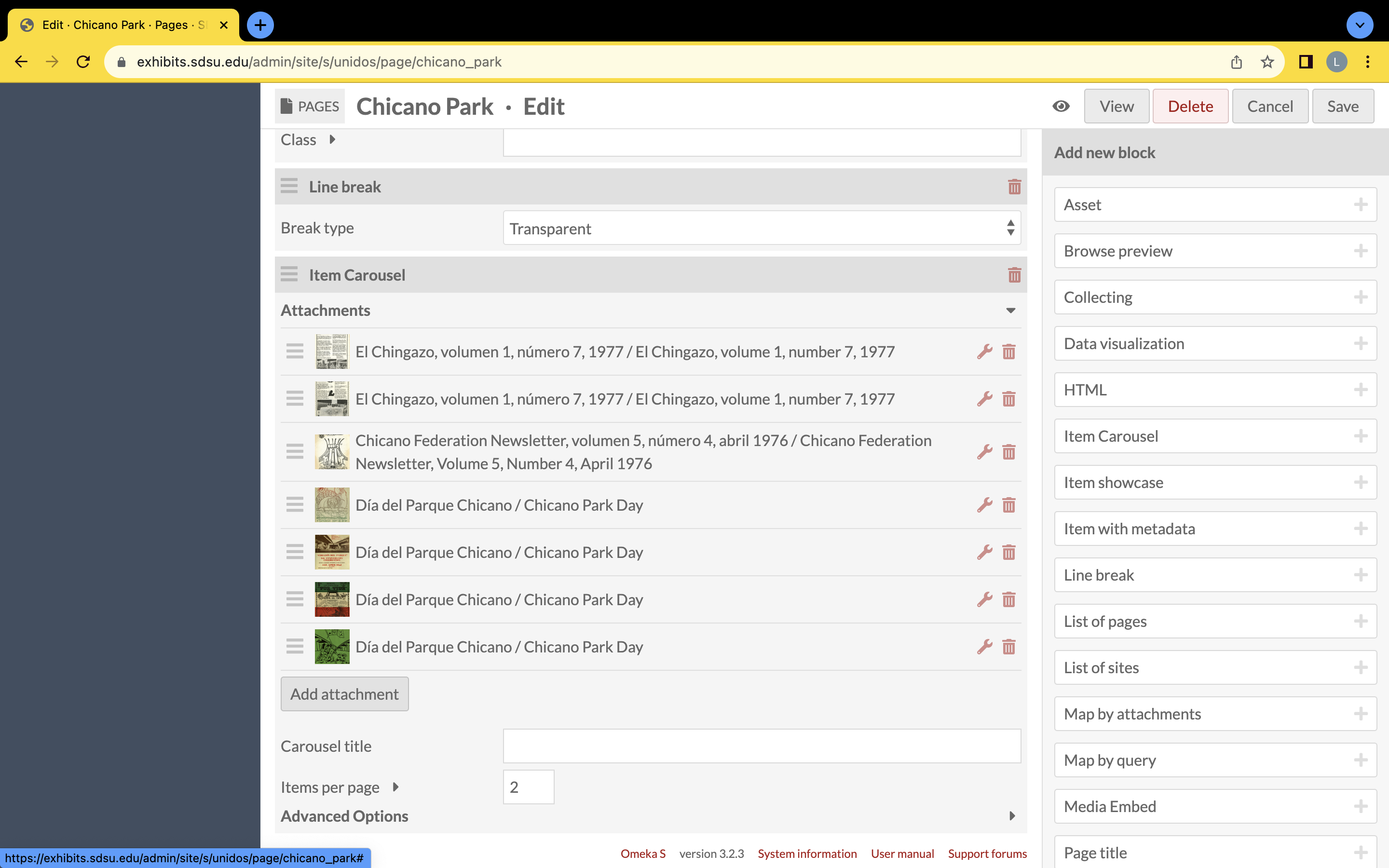
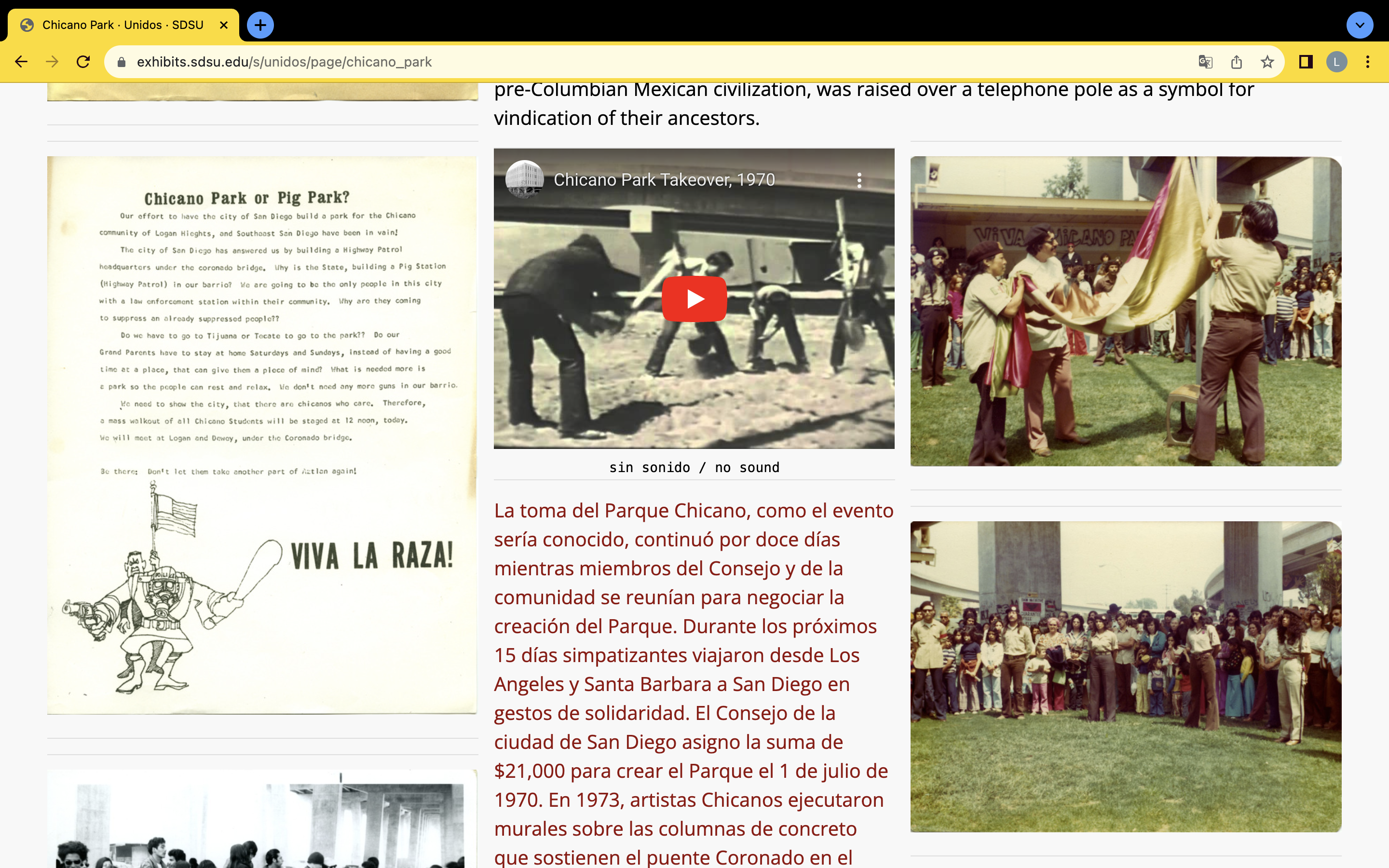
This fifth column contains the item carousel block. To end the “Chicano Park” page, the curator decided to end with an auto rotating carousel of images showcasing the park’s activities and celebrations that continued after the Chicano Park takeover. As the main page’s page discusses, the auto slide duration is set to milliseconds for Omeka S item carousels, so setting the auto slide duration to 2000 meant that the carousel moved every two seconds.
Five columns of images presented above show how the Omeka S “Unidos” site’s “Chicano Park” page was created.
The "Chicano Park" page started with a bolded teal colored heading that consisted of part of a quote. Then the bilingual text was split into two rows (Spanish was on the left with one of SDSU's signature red colors and English was on the right with the Omeka S default text color). After the split text, a transparent line break created space from the image that followed. Because of the line break the following image appeared evenly with the next text bloc. This media embed floated to the left. Next, on the back-end of this page was another media embed that floated to the left although on the front-end a bloc of Spanish text appears beside the first media embed. Yet, on the back-end the red Spanish text followed the second media embed in an HTML block. Then another media embed that floated to the right was previos to the English text that connected to the Spanish text from above in a separate HTML block. Afterwards, one media embed floated to the right, another floated to the left, then the YouTube video was a media embed that floated to the center. The last media embed floated to the right and then there were two HTML blocks that separated into Spanish and English with Spanish first and the English HTML block below the Spanish HTML block. This order arranged in the back-end created a front-end design that encased the text in images. After the text blocks is a transparent line break and then the item carousel with seven images on an auto rotating slide of 2 seconds with two images visible at a time.
Why the back-end had to be organized this way to create the front facing visual is still a mystery, but it accomplished the desired look that the curator was aiming for. The best way to successfully create a page is to draw out what you would want the page to look like and then move around the added blocks to formulate the style you wish to achieve with your materials.